MILLIE SHOOT #002 -
19TH MARCH
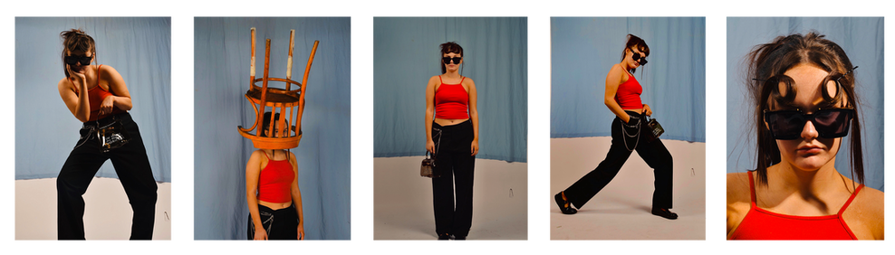
A key component to the images i shot is the use of solid, radiant colours, for example the rest vest top and the blue sheet of fabric placed in the background of the shots. The reasoning behind this was to achieve this vivid summer style that Martin Parr captures in a majority of his photos. I find his bold British summer shots particularly captivating as there's a nostalgic aspect attached to them, a reminded of better of better times. I've been familiar with Parr's work for sometime now and figured how can i incorporate his style throughout my own work? The difference being fashion photography and documentary; two striking styles yet so different when compared. I remembered the lucid tones of colour across his work and decided to try and reflect that within my own photography, creating this 90's retro like scenario. Staying true to my word on sustainability, everything with the images was pre-owned and nothing was payed for pre-shoot as the importance of providing the idea of contemporary fashion through sustainable methods is very much one i'm sold on communicating through my work across this project. I think that this shoot was good stepping stone, in the sense that i know roughly the attitude of what i'm wanting to shoot, now it's just a case of what steps do i now take next to evaluate my next shoots? i'm aiming to shoot on location some time soon and possibly capture contemporary through a documentary style of photography and setting, combining natural elements of documentary with the exciting style and edge of fashion photogtaphy.
|
ANALYZING MY OWN WORK:
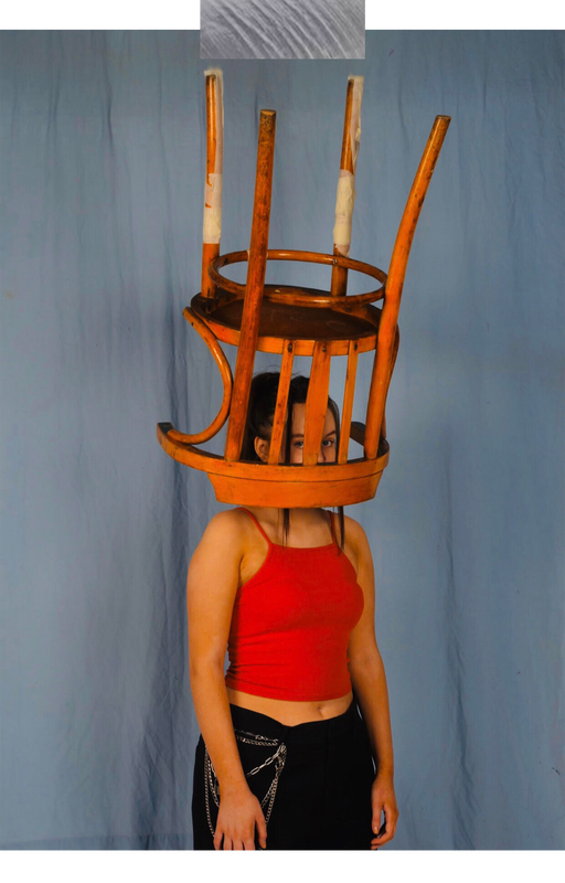
This image here is probably the one that required the most planning due to the safety checks needed. The chair was hung from the railings above with only masking tape on it's back two legs, though not the most efficient way to approach this, i achieved the effect i wanted to give off in the end and i think it proved quite effective. As mentioned earlier, this entire shoot was inspired by the striking colours within Martin Parr's work and trying to translate that through my own images. I think overall it was actually quite successful, surely it's not an immediate connect but i do definitely think there's a parallel between the two when compared. The overall feeling of the image is summertime, more specifically this 90's British summer that i never experienced, a calm blue drape in the background depicting the sky accompanies in communicating the vision i had initially to a further extent. |
"FINAL MAJOR PROJECT"
2020, Dylan Smith
